PanchCo Painting
Overview
PanchCo Painitng is a new family Owned business looking to make a name for themselves in the home remodeling business. They work directly with home owners or as a subcontractor to a construction company.
Understanding the Problem
Since PanchCo painting is a new company, they need to get their name out there to as many potential clients as possible. What is the best way for people to learn about the business but to also convert them into clients.
With PanchCo Painting being a new company, there are multiple ways to approach this problem. Each comes with pros and cons but decided to look at the three main options.
Company website
Yelp/Google ads
Business cards
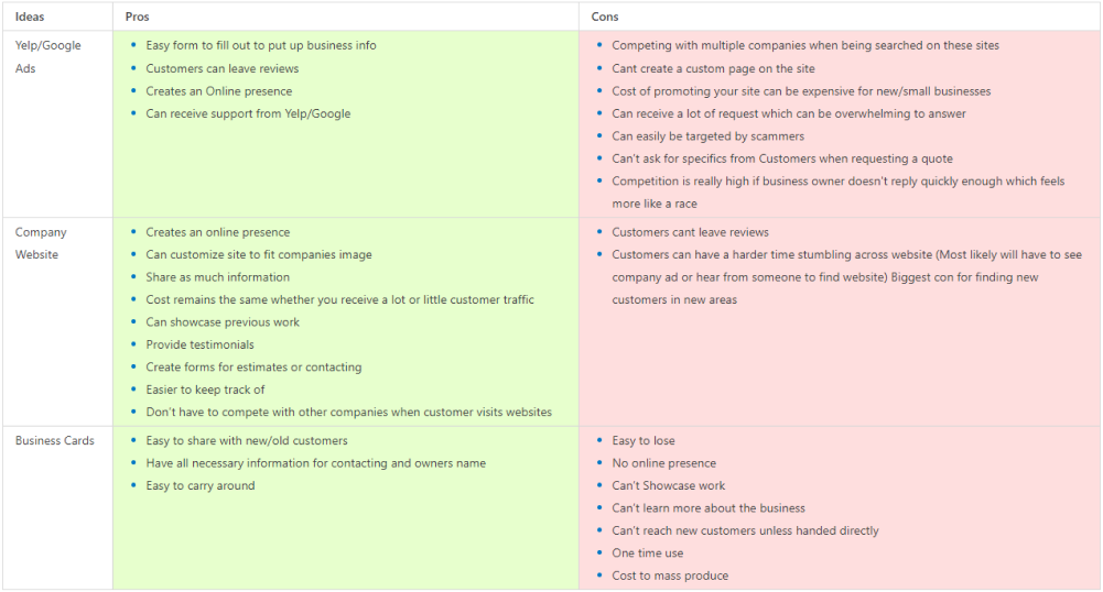
After looking at the Pros/ Cons for the top three options , focusing on creating a company website would be the best outcome. Not only does the company website offer more pros and less cons, it is the most cost efficient for a new company that doesn’t have the biggest cash flow at the current moment.

As a contractor, I need to find a painting contractor who I know can properly paint a house/business in the fastest time possible without the quality of the project suffering to ensure I can still profit as much as possible and focus on other tasks.

As a home owner, I need to find a painter to help me paint my house properly without taking forever at affordable/ reasonable prices so my home can look great and I can be satisfied.
Product Vision
Now that we have decided to create the website, We had to figure out what needed to be on there. For example
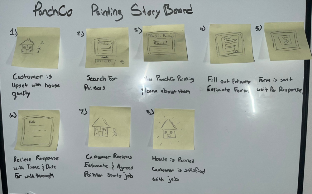
The UX Story Board helps remind me the main objective is for users to have the ability to contact the business and how the user must feel when visiting the website. The user is visiting the website site because they are looking for someone to fix a problem they have. With the user visiting the website with not the best mood to begin with, therefore need to focus on the UX to be easy to understand and for them to reach their goal as fast as possible
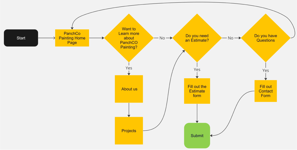
With the story board done, creating the user flow was next. As stated before, the main direction is to push users to request an estimate. The website doesn’t need much paths but the paths should lead to contacting the business in some way.
Version 1 of PanchCo Paintingg
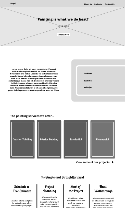
For my first irritation of the website I skipped the LO-FI stage which I later realized was a big mistake. I started by creating each section starting with the Nav Bar. The problem with doing it the way I did, I just place the information with no thought on where the information should belong.
My main focus during this was creating sections for the information the company needed on the website and just placing it wherever. This is a big problem since the user and what information they are seeking isn't given a thought while designing the site.
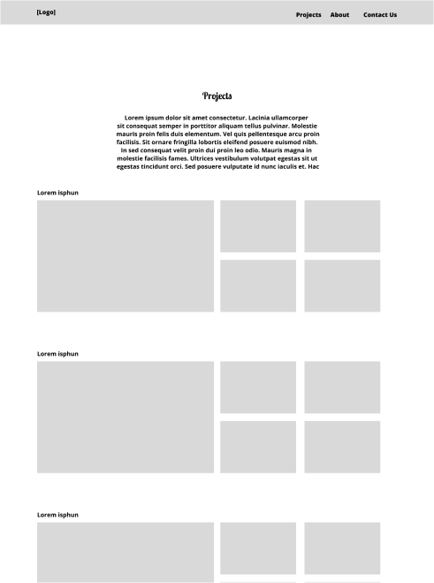
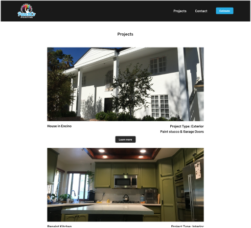
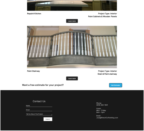
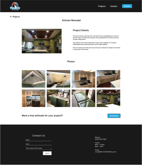
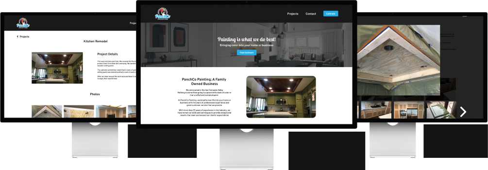
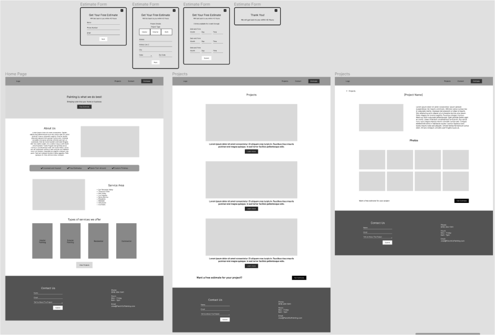
The Projects page was done extremely simple when first created. I was just showcasing previous work but no information about the pictures which leaves the user wondering what work was exactly done.
Other key problems with the site was; It was missing a estimate CTA and the fonts weren’t the best when it came to legibility The spacing throughout the website wasn’t the best either.
Version 2 of PanchCo Painting

When drawing out the lo-fi sketches I really put a focus on designing with a purpose. I had to have a reason on why things where placed where they were and designed that way. Writing the notes also help me remember what belongs where. During this stage its easy to create which allows me to focus more on the why I’m creating the pages, instead of how to create the pages.
With clear sense of direction and understanding where things belong, it was quick and easy creating the Mid Fidelity.
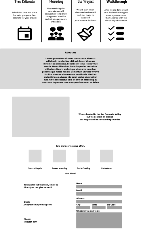
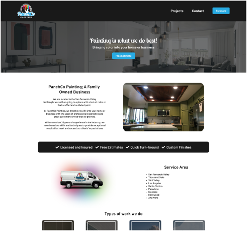
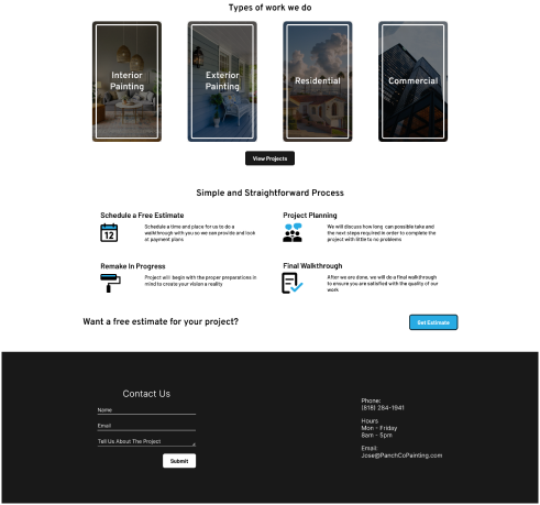
With this irritation I focused more on what the user would like to see first. About the business was first since a lot of people enjoy supporting local family owned businesses. Second was the area where the company operates, since clients need to know if they can even request PanchCo Painting services. Finally the most important was the “Get an Estimate” CTA placed throughout the website. Making it easier for users to get to the form with a simple click of a button,
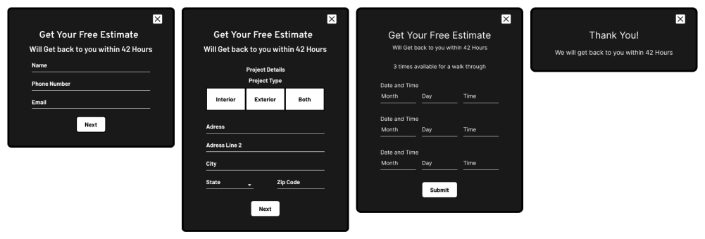
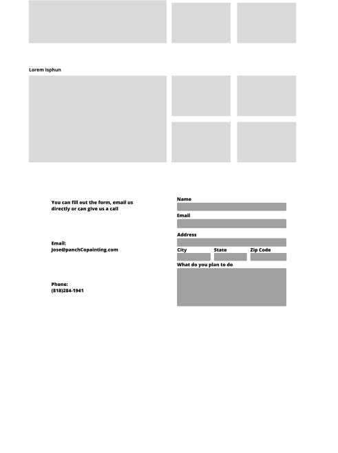
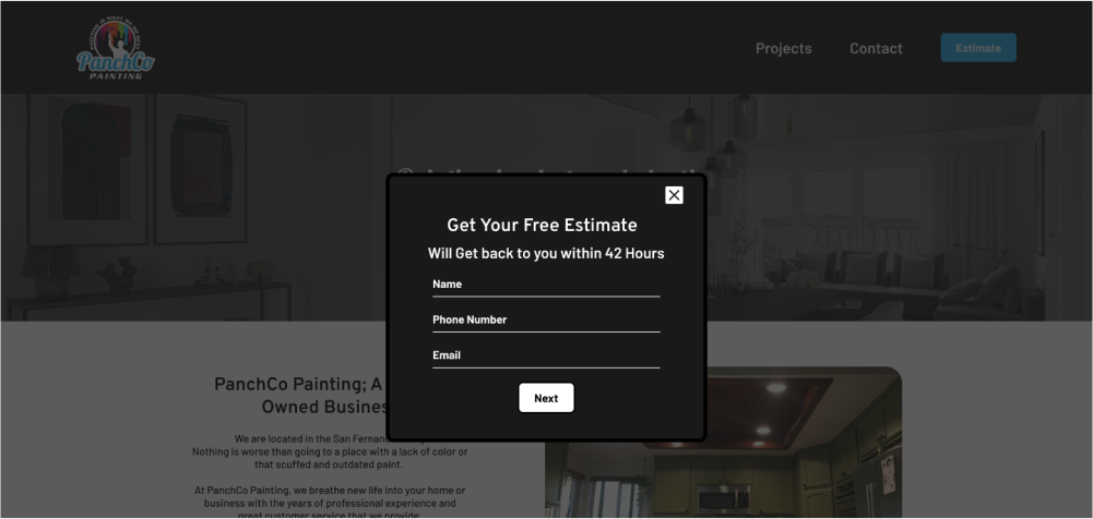
The estimate form was created with the minimum yet important information to start the process to a project and convert users to clients
What is next is looking at how many users visit the website and compare it to the monthly amount of times users have contacted the company for estimates. Another is to add more information as the company grows. Possibly adding testimonials from previous customers and more work to the projects page.
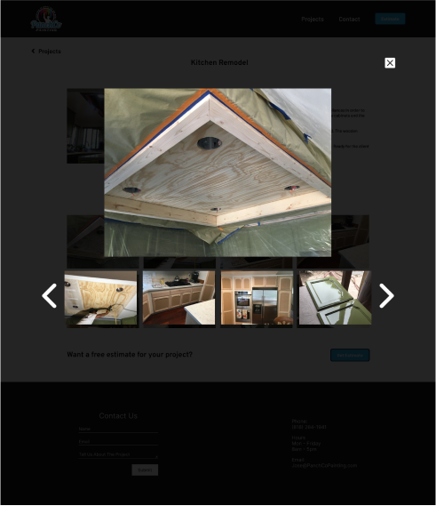
I used webflow as the website builder to create the site. Since I cannot code, I couldn't create the pop-up estimate form. As a work around I created another page to host the estimate form. I did minor changes to the contact form and extra instructions when it comes to expanding the pictures in the project detail page since some users didn't know they had that option.