Game Over Studios

Overview

About Game Over Studios

Game Over Studios is a drumming class with a video game aesthetic.  The drumming instructor teach beginners to advanced drummers. It is a business ran by himself.

Role

UX Designer

Understanding the Problem

What is the problem?

With covid affecting in-person lessons. We need to create an online application for the students to be able to access their classes, schedule 1 on 1 sessions , and pay for more lessons. This transition help his drumming classes to become a hybrid class.

How am I going to tackle this problem

My team and I will interview the drumming instructor, as well as his students and parents. We plan to learn what both sides are seeking and create a student/ instructor portal from them. The site will also help to advertise the instructors business.

The User Base

Since the drum students age range is mostly from  8 to 12 year-olds, parents are important to consider. The parents will be the ones accessing the student portal the most. With that being said we were focused on learning 4 important things from them.
The expectations they held from the instructor
What characteristics users searched for when choosing an instructor
How users preferred to pay for classes and how to schedule those classes
Their previous experience with student portals

Competitive and Comparative Research

Competitive Research:

For we took a look at two online services that offered classes for drumming. We wanted to take a look at what was attracting users and the layout they used. After looking at them we took note of a few important features that stood out to us.
  • The website provided a good understanding on what material the courses were covering
  • The website was professionally made with very good user layout, directing them to purchase the course
  • Since its solely an online course it didn’t provide enough information on how the course would be
  • The site provided a lot of information surrounding instruments such as articles, videos and their own FAQ section
  • The site lacked information on the instructors themselves.
  • The site navigation is very crowded. It is easy for users to get lost in all of the information

Comparative Research

We decided to look at these two sites so we can experience their version of a student portal. We were curious how other companies managed their progress, the layout and the navigation of the portal.
  • The student portal was easy to find and access. The student portal was designed with the same layout for both desktop and mobile version.
  • The student portal had a landing page with links to lead them directly to the most used parts of the portal
  • The portal had some navigation issues where users couldn’t visit previous page unless they refreshed the page completely.
  • The student portal had a very simple and straightforward navigation layout
  • The student portal was easy to locate within the main site and had its own CTA
  • Once entering the portal, returning to the main site was not possible unless retyping its URL

User Flow

Since it is a website and student portal created from scratch, my team and I created the user flow that we needed a user to achieve and was simple to understand at first glance.

Site Map

With the user flow done, the site map was easily created. This helps us to keep the navigation simple and keep track of the pages we have to create when designing the site

Sketches

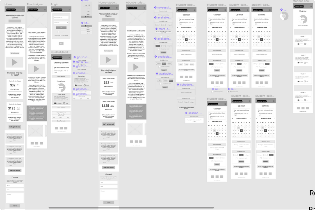
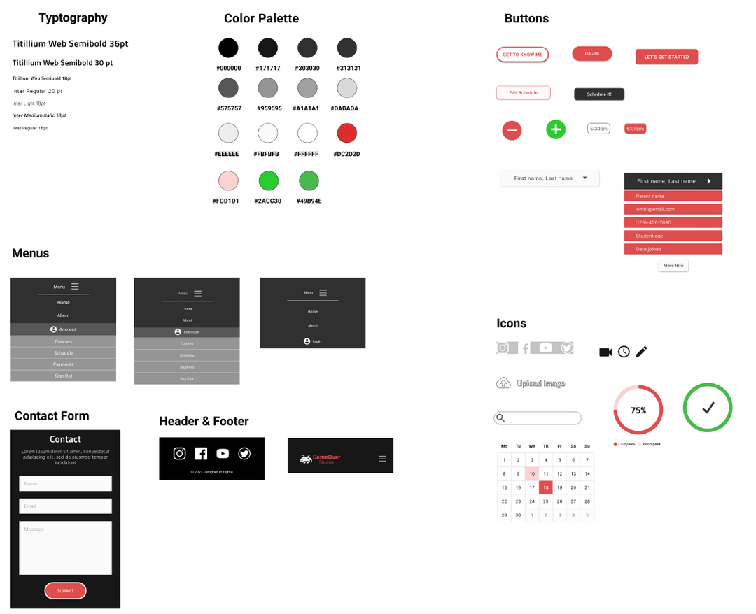
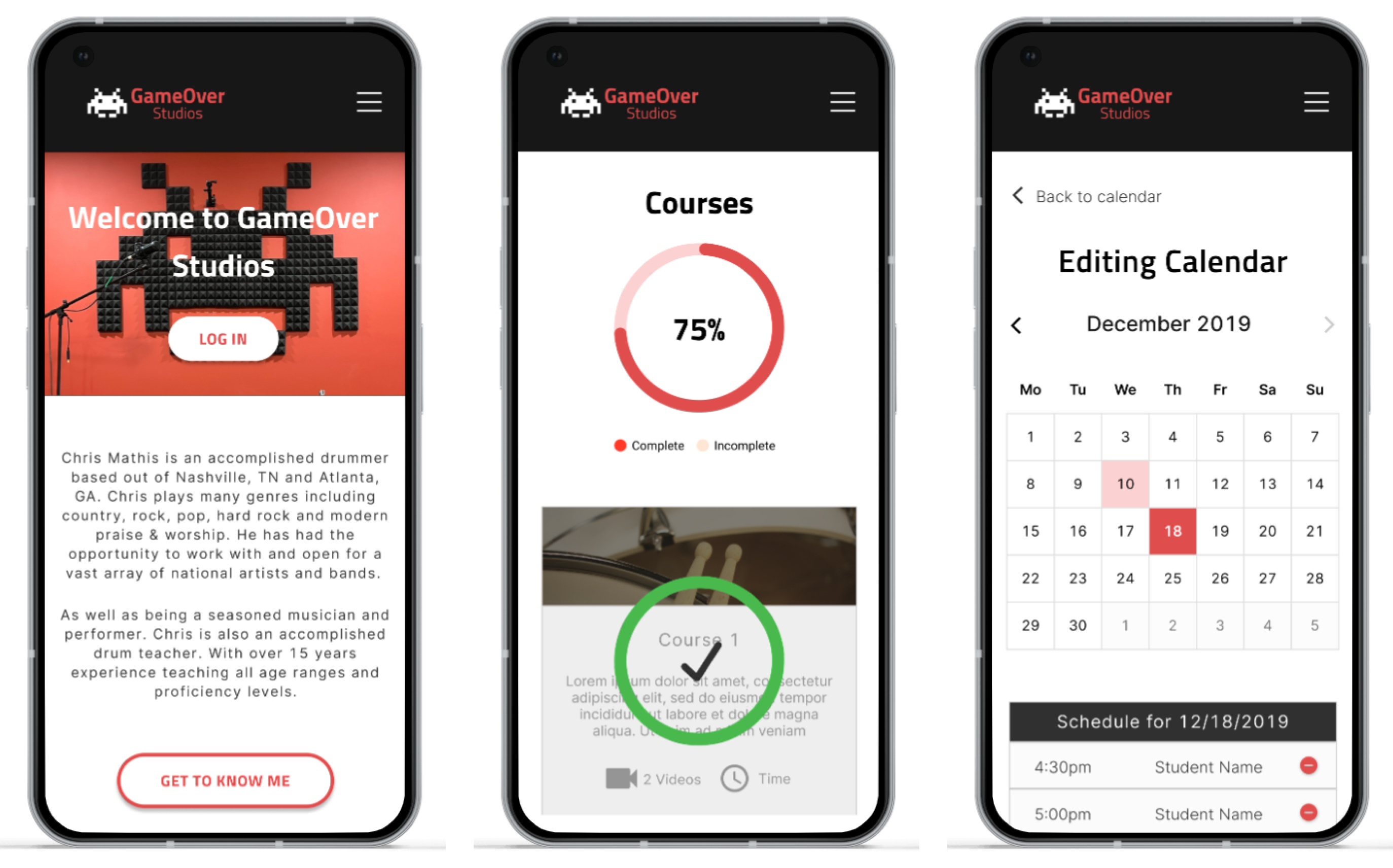
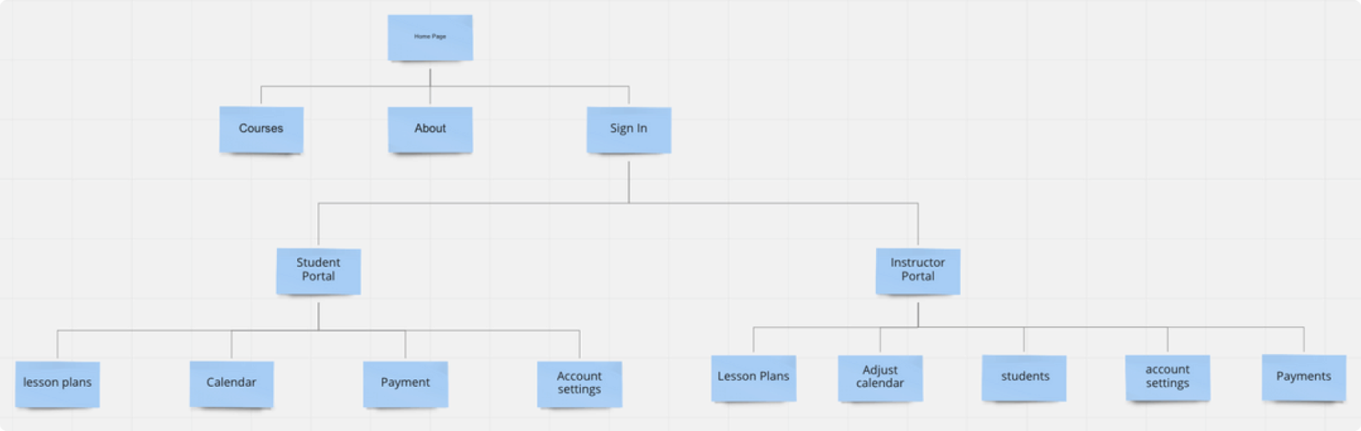
Since it was a group project, 3 of us took a day to create sketches. Right away we noticed some similarities, but noticed some features the other two didn't think of. We discussed why we drew the designs and picked out the best parts and started creating the mid-fidelity.

Mid-Fidelity

After the sketching, we each assigned pages and features to design. We overlooked our work and made sure the designs were consistent throughout all of the pages

Mid-fidelity Prototype Usability Testing Findings

Before we continued with creating the Hi-Fidelity of the design, We wanted to know if there were any issues when it came to the interface. We created a prototype and had users test the website. We found multiple users struggled understanding where the course tab would lead. There was no indication when a student was signed in vs the instructor. The most important the drop down menu was missing when entering the portal for both the instructor and students which would cause users to have a tough time navigating the site.

Style Guide

While making the changes to the design to fix the issues we came across after the usability testing, another UX designer and I were creating the style guide for the HI-fidelity design

HI-FI Prototype

After the style guide and changes were made to the design, we created the HI-fidelity prototype. You can access the prototype below.
View Prototype

Let’s create great designs that solve everything

Email:
jose.espinoza0852@outlook.com

Thank you! Your submission has been received!
Oops! Something went wrong while submitting the form.